According to Bank of America, institutional clients have been the biggest seller on their books since January and the 4th most on record in the last week. Meanwhile, retail clients continued to buy into their selling.
We end the week with yet another misinterpreted statistic.
The United States Bureau of Labor and Statistics (BLS) released April's jobs data and it shows that job increases far exceeded the expected number, sending the unemployment rate down to 6.3%.
The total employment, according to the establishment survey (where businesses are asked how many people they hired in the month), is now less than 100K jobs away from where it was back in December 2007. Wow.
Could employment levels in United States really be back near the levels prior to the 2008 crash? After all, it has been six years.
Not so fast.
I have talked about the discrepancies of the jobs data many times. Those who haven't read those entries can find a few here:
The April jobs data from the BLS is just another fabrication of what's really happening in the U.S; a sort of creative accounting-type conclusion on jobs.
It appears that the United States is now nearing the Fed's 5.5% target unemployment rate at super speed. But what about those who continue to leave the workforce?
We know the unemployment rate is derived from those who are participating in the workforce, i.e. those who want work.
So how many people actually want to work?
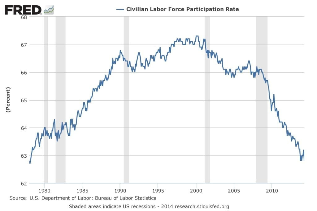
Another Look at Labor Participation
Coincidently, that's the same percentage drop (0.4%) as the unemployment rate (from 6.7% to 6.3%).
The difference?
The 0.4% drop in unemployment was a result of 288k new jobs, while the 0.4% drop in the labor participation rate means a whopping 800k people left the workforce.
Hmm...
Every year millions of people leave the workforce and those not in the labor force in the U.S. has increased every year for the past decades.
That's nothing new.
However, the speed in which this number has grown since 2008 has been remarkable.
Just take a look:
Do Baby Boomers Really Matter?
The argument for the stunning number of those leaving the workforce is that the participation rate is being pushed down by demographic trends, in particular retiring baby boomers.
There's no question that the baby boomer generation represents a vast number of the United States population. But if the above argument is true, it would mean three things:
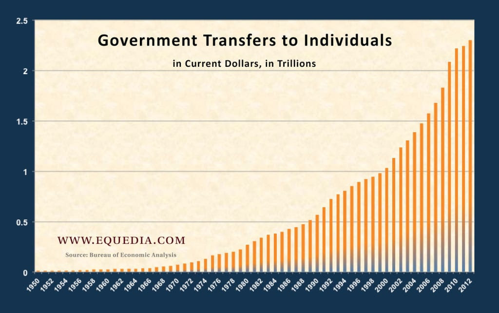
- More people will be on Social Security in the U.S. than ever, which means less people working and more people collecting a government paycheck.
- Ditto on Medicare and Medicaid (see Unemployment vs. Employment)
- The number of younger citizens entering the workforce is not growing as fast as those leaving the workforce.
Points 1 and 2 are obvious and inevitable. As a matter of fact, it's happening as we speak.
Here's a chart from a past letter showing government transfers to individuals, with the majority (nearly 90%) coming from income maintenance (entitlements based on poverty or income status), Medicaid, Medicare, Social Security, and unemployment insurance:
But what about Point #3? Are the amount of people entering the workforce really that much smaller than the baby boomers leaving, as many of the arguments related to baby boomers being the cause of the declining labor participation rate suggest?
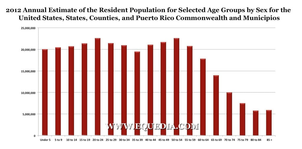
Let's take a look at the population estimates released July 2013 (you may want to click on the image for a closer look):
If we simply focus on the year 2012 population estimates of the United States, and without going into complex and exact calculations, you will see that the amount of Americans for every five year age gap is almost the same up to age 60 and above, after which the population starts to decline:
The population for those aged 20-24 (about the time when people begin to really look for jobs) is almost identical to the population of those aged 50-54 (about when people really start considering leaving the workforce).
In other words, according to these estimates, there should be as many Americans replacing every baby boomer that leaves the workforce over the next 60 years.
Even the BLS is, "puzzled why so many unemployed people are not looking for jobs."
And here the media continues to talk about economic number fudging in China...
What do you think? Are baby boomers really the reason for the declining participation rate?
Another Shocking Look at Margin Debt
The stock market is still climbing and I still say it's the amount of leverage and risk that's been manipulated into the system.
The Fed's goal is to ensure people take risks; to make people believe that the world is a better place because there's more money available the Fed exists.
Over the past few years, I have talked about the ever-increasing amount of Margin Debt (the amount of money that someone borrows to make bets on stocks) at the NYSE, which continues to set new record highs.
A few years ago, the amount of money people were borrowing to buy stocks on the NYSE rose back to pre-2008 levels.
Since then margin debt levels have continued to rise, right alongside the S&P 500. This clearly shows that the stock market continues to be propped up through leverage.
But there is an important factor that many have overlooked; I'vetalked about this before, but we should really be taking a closer look now.
Back in February, NYSE margin debt levels hit an all-time high of nearly $466 billion. It sounds like a lot - and it is - but if the market keeps going, it's not necessarily a terrible sign because it shows confidence in the market.
However, it's not the record high margin debt levels I am worried about; it's the fact that for the first time since the crash of 2008 that margin debt levels have crossed the performance of the S&P 500 on a relative basis.
Take a look:
In the last decade, every time NYSE margin debt levels have crossed the S&P 500 on a relative basis, the S&P 500 has fallen dramatically in the following months.
Is the recent cross a sign of things to come? Keep a VERY close eye on this gauge.
How the Market Works
In many past letters, I have explained how the stock market works; how the retail investor is always the one that gets burned.
When stocks suck, institutions put fear into the retail investor forcing stocks even lower. As they head lower and no one wants them, institutions starts accumulating, buying stocks back up. As this uptrend continues, retail investors decide to get back into the game and the retail fund flows enter the market leading us to higher highs.
If you have been following my letters over the past five years, you will have picked up on this strategy many times. It's why I said the S&P 500 would soar passed 1800.
Stocks are now at a point where the value is in the trend of the market, as opposed to true fundamentals.
This usually signals a time when institutions begin to sell-off into the liquidity created by the retail investor.
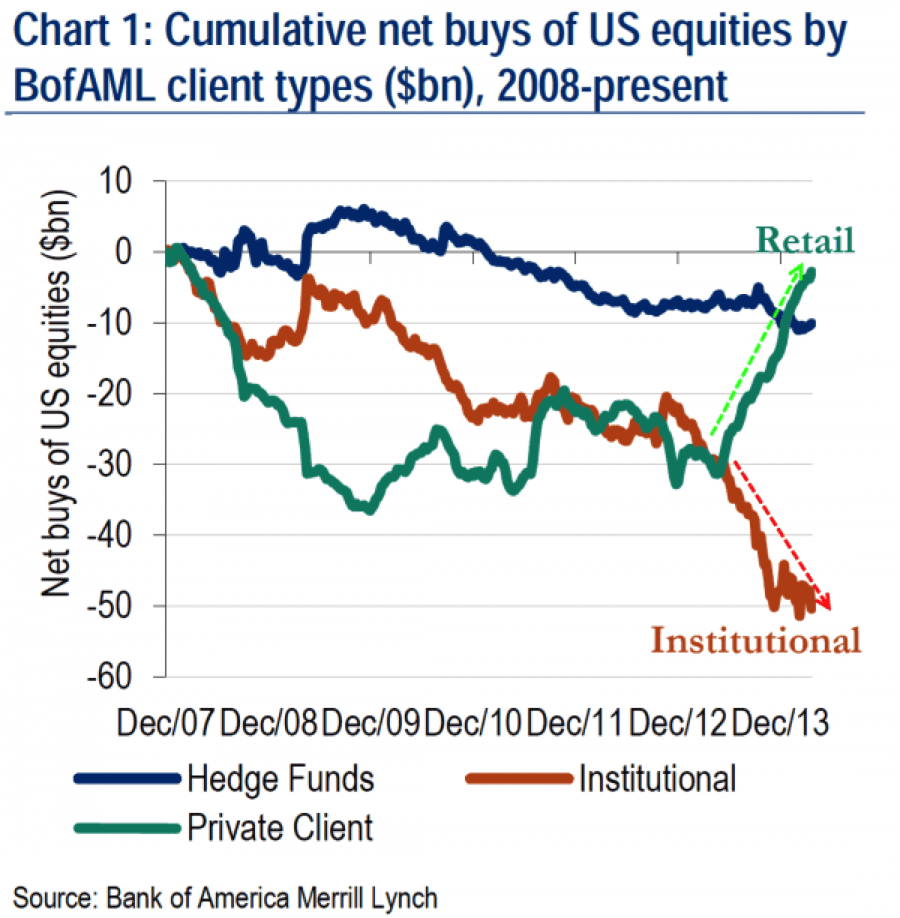
So let's take a look at the recent data from Bank of America, the second largest holding Company in the United States and one of the largest companies in the world, and see what it's doing:
This chart from Zerohedge shows that net sales of U.S. equities were mainly due to institutional clients, who have now sold stocks for the last five consecutive weeks and remain the biggest net sellers year-to-date.
According to Bank of America, institutional clients have been the biggest seller on their books since January and the 4th most on record in the last week. Meanwhile, retail clients continued to buy into their selling.
Just some food for thought.